


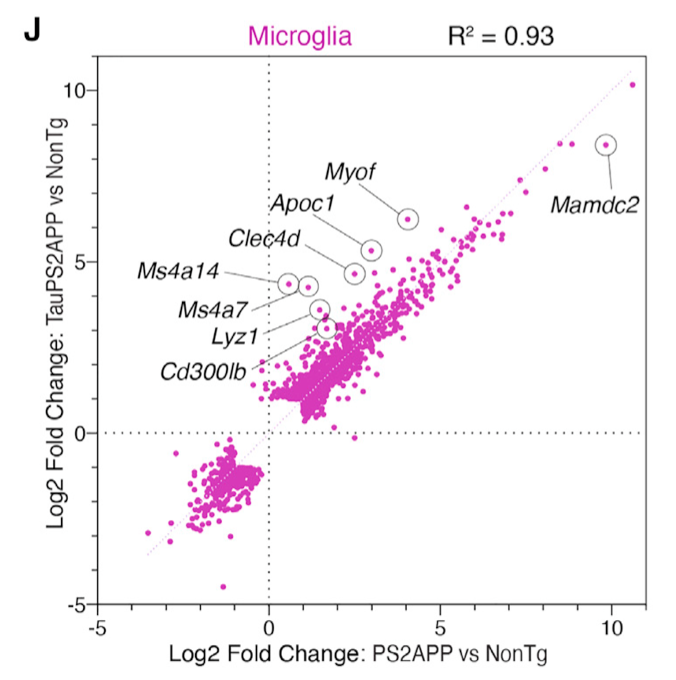
前些天学徒在单细胞数据分析交流会议上面分享了2021发表在 Cell Reports 杂志的文章:《TREM2-independent oligodendrocyte, astrocyte, and T cell responses to tau and amyloid pathology in mouse models of Alzheimer disease》,提到了如何对两次单细胞差异分析后的结果进行相关性散点图绘制,如下所示:
相关性散点图绘制
图例也写的很清楚:
也就是说,它并不是拿两次差异分析各自统计学显著的基因的交集去绘图,而是把在两次差异分析至少有一次是统计学显著的基因拿过去。(说起来一样的绕口,让我们看看后面的代码)
我们这里仍然是以为pbmc3k例子:
library(SeuratData) #加载seurat数据集
getOption('timeout')
options(timeout=10000)
#InstallData("pbmc3k")
data("pbmc3k")
sce <- pbmc3k.final
library(Seurat)
table(Idents(sce))
复制
可以看到这个数据集被注释成为了9个单细胞亚群:
> as.data.frame(table(Idents(sce)))
          Var1 Freq
1  Naive CD4 T  697
2 Memory CD4 T  483
3   CD14+ Mono  480
4            B  344
5        CD8 T  271
6 FCGR3A+ Mono  162
7           NK  155
8           DC   32
9     Platelet   14
复制
我们可以看看 CD14+ Mono 和 FCGR3A+ Mono 这两个单核细胞亚群,各自跟B细胞的差异基因,是否有比较好的相关性。
首先做两次单细胞差异分析:
CD14_deg = FindMarkers(sce,ident.1 = 'CD14+ Mono',
                  ident.2 = 'B')
head(CD14_deg[order(CD14_deg$p_val),])
FCGR3A_deg = FindMarkers(sce,ident.1 = 'FCGR3A+ Mono',
                       ident.2 = 'B')
head(FCGR3A_deg[order(FCGR3A_deg$p_val),])
复制
如果这个时候,我们拿两次差异分析各自统计学显著的基因的交集去绘图,代码如下所示:
ids=intersect(rownames(CD14_deg),
              rownames(FCGR3A_deg))
df= data.frame(
  FCGR3A_deg = FCGR3A_deg[ids,'avg_log2FC'],
  CD14_deg = CD14_deg[ids,'avg_log2FC']
)
library(ggpubr)
ggscatter(df, x = "FCGR3A_deg", y = "CD14_deg",
          color = "black", shape = 21, size = 3, # Points color, shape and size
          add = "reg.line",  # Add regressin line
          add.params = list(color = "blue", fill = "lightgray"), # Customize reg. line
          conf.int = TRUE, # Add confidence interval
          cor.coef = TRUE, # Add correlation coefficient. see ?stat_cor
          cor.coeff.args = list(method = "pearson",  label.sep = "\n")
)
复制
可以看到相关性,非常:
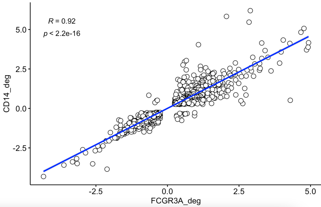
两次差异分析各自统计学显著的基因的交集去绘图
不过,作者是把在两次差异分析至少有一次是统计学显著的基因拿过去绘图,英文的描述是Only genes called as DEGs (FDR < 0.05, fold change >2 or < 2) for either comparison are shown.
所以前面的 FindMarkers 函数需要调整参数哦,首先是推荐 logfc.threshold = 0,以及 min.pct = 0 ,这样返回全部的基因的差异分析结果。修改好 的代码如下所示:
CD14_deg = FindMarkers(sce,ident.1 = 'CD14+ Mono',
                  ident.2 = 'B',
                  logfc.threshold = 0,
                  min.pct = 0
                  )
head(CD14_deg[order(CD14_deg$p_val),])
FCGR3A_deg = FindMarkers(sce,ident.1 = 'FCGR3A+ Mono',
                       ident.2 = 'B',
                       logfc.threshold = 0,
                       min.pct = 0)
head(FCGR3A_deg[order(FCGR3A_deg$p_val),])
ids=c(rownames(CD14_deg[abs(CD14_deg$avg_log2FC)>2,]),
              rownames(FCGR3A_deg[abs(FCGR3A_deg$avg_log2FC)>2,]))
ids
df= data.frame(
  FCGR3A_deg = FCGR3A_deg[ids,'avg_log2FC'],
  CD14_deg = CD14_deg[ids,'avg_log2FC']
)
library(ggpubr)
ggscatter(df, x = "FCGR3A_deg", y = "CD14_deg",
          color = "black", shape = 21, size = 3, # Points color, shape and size
          add = "reg.line",  # Add regressin line
          add.params = list(color = "blue", fill = "lightgray"), # Customize reg. line
          conf.int = TRUE, # Add confidence interval
          cor.coef = TRUE, # Add correlation coefficient. see ?stat_cor
          cor.coeff.args = list(method = "pearson",  label.sep = "\n")
)
复制
出图如下所示;
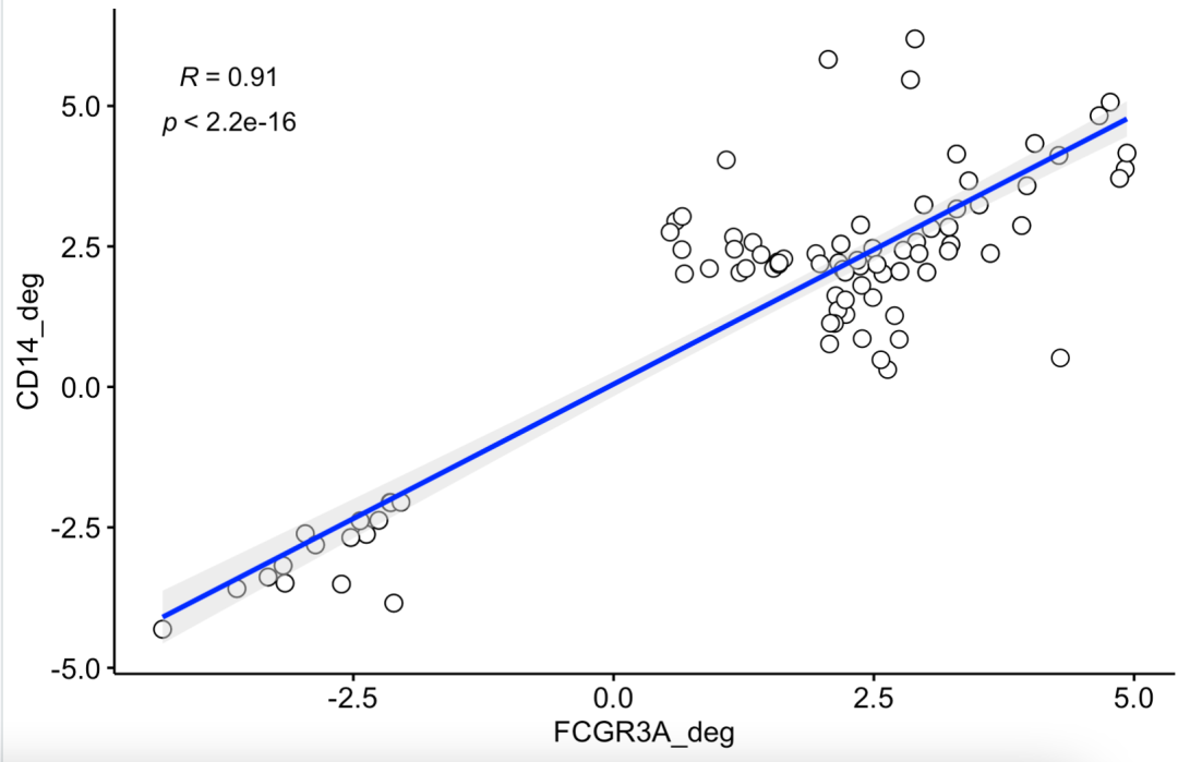
这个时候,会出现一下基因在两个差异分析结果里面出现冲突了,并不是在两次差异里面都统计学显著。
如果你对单细胞数据分析还没有基础认知,可以看基础10讲:
最基础的往往是降维聚类分群,参考前面的例子:人人都能学会的单细胞聚类分群注释

发表评论